Lab 9
Jump to Initial set up –
Calculating aspect –
Performing viewshed analysis –
The final product
Initial set up
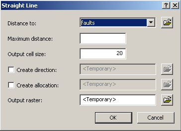
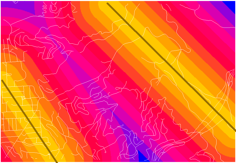
I took the data that I had at the end of doing the lab and did my assignment on top of this data. I added the faults shapefile and then used Spatial Analyst->Distance->Straight Line... as follows
coming up with the following map:
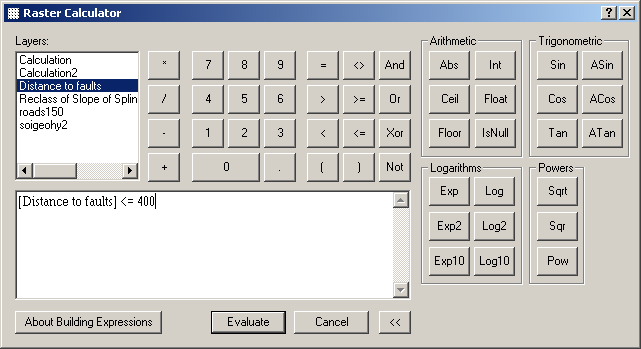
Then, to make the 400-foot constraint, I used the raster calculator to make the calculation [Distance to faults] <= 400 like this:
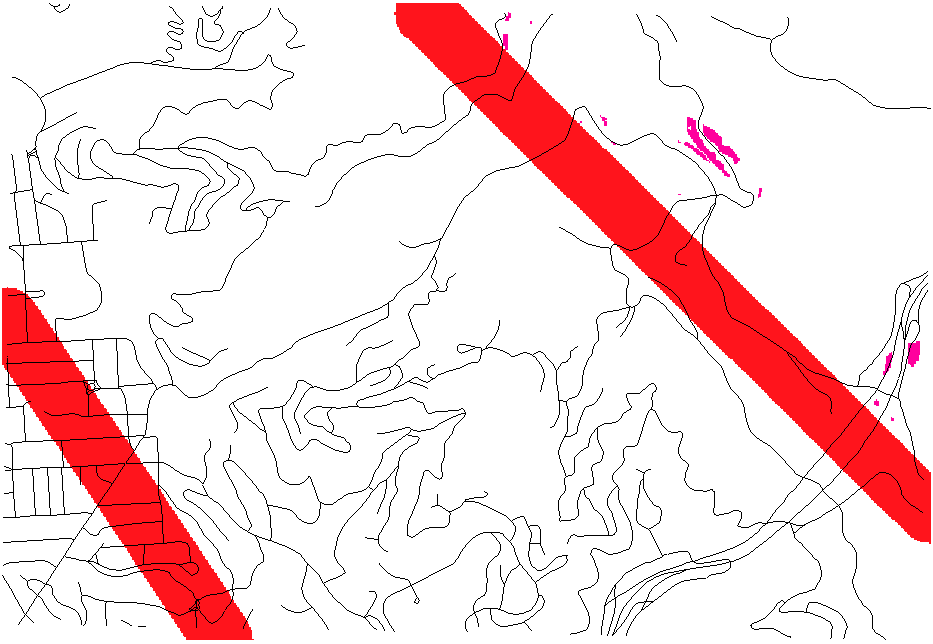
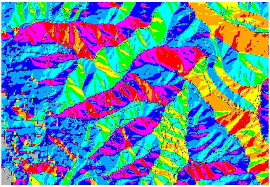
I also took the data that we already had for high slope gradients within 150 feet of roads and modified the colors so that calculation result 0 was transparent and calculation result 1 (= high slopes) was a bright pink-red. I made the fault buffers a bright red. This resulted in the following map:
Calculating aspect
I then added some opportunities to the data: I decided that a house generally facing the west is a good idea so that the occupants could have a nice view of the San Francisco Bay, especially if the house is up in the hills. I used the spline of spots as the input surface and was able to generate the following aspect map:
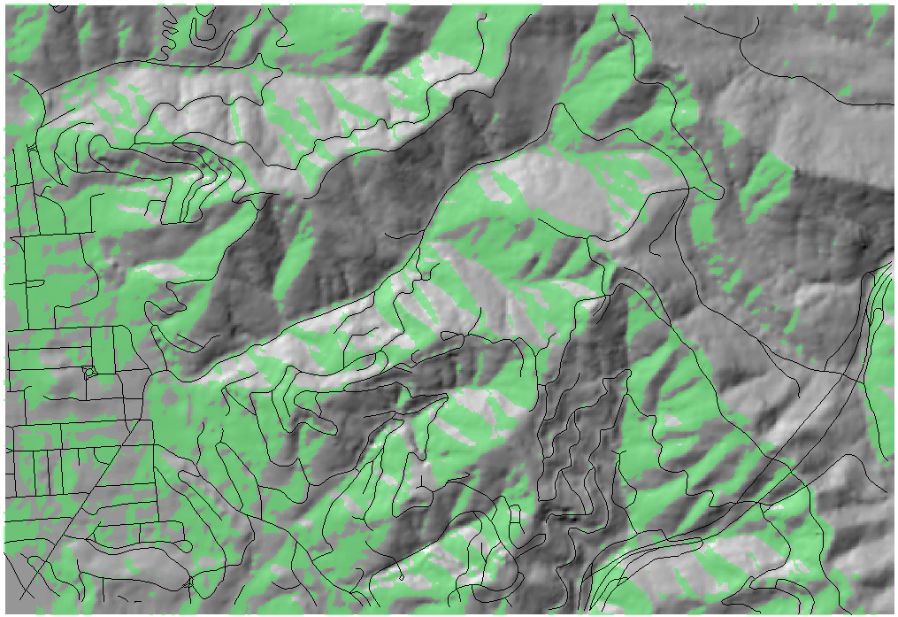
I then used the raster calculator to only keep regions whose aspect value was between 225 and 315, which is between the cardinal directions southwest and northwest, which I believe to be a good approximation that the Bay is visible from a given point in that aspect. I colored value 1 green (= true) and made the 0 value (= false) transparent. This resulted in the following map (with the hillshade behind the calculation and roads for context):
Performing viewshed analysis
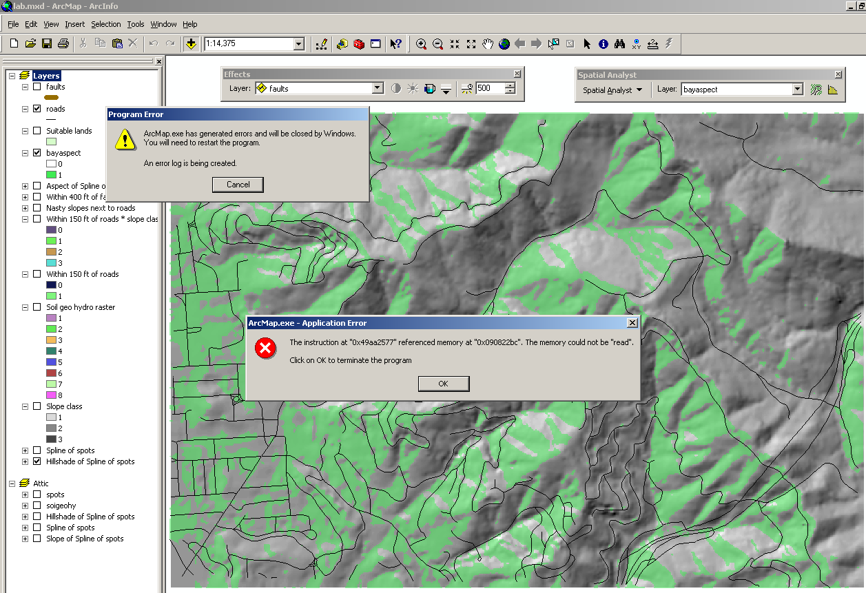
I then decided to see if I could perform some sort of viewshed analysis on the data to get a more precise measurement on Bay visibility than just slope aspect. I thought that a good simplification to achieve this result would be to draw a line at the western edge of the map to represent the bay, which would be the observer, and run the viewshed analysis on the Bay aspect data that I had already generated. To do this, I went into ArcCatalog and created a new polyline shapefile. However, when I tried to add the shapefile to my layout, ArcMap provided me with a very unappealing response:
It turned out that the reason for this was that the shapefile contained a space in its name: I had named it "Bay view". When I created a new shapefile with the name "bayview", everything went smoothly. I then edited the shapefile and just added a single line to it at the edge of the map. Since the viewshed analysis tool takes as observers line and point shapefiles, I was done in my preparation. I then performed the viewshed analysis with the "bayview" line as the observer and the Bay aspect calculation as the input (the rationale being that if the Bay can "see" the houses, then the houses can see the Bay) and came out with this map. Areas in red can't "see" the Bay, areas in green can, and the thick blue line on the left represents the observer line used in the analysis.

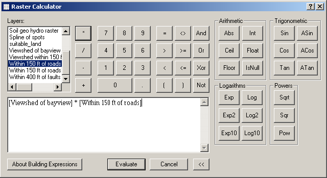
I then used the raster calculator to intersect the viewshed with the 150-ft road buffer that we had created previously:
The final product
Now came the time to put everything together. The result of the viewshed multiplication actually provided three values, two of which were desired. Consequently, I chose to map it as Quantities->Graduated colors, changed the number of classes to 1, and used the "Data exclusion" option to get rid of the one value I wasn't interested in. (From the Symbology tab, choose Quantities->Graduated colors, then click on "Classify..." 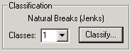 , then choose the number of classes to be 1 and click on "Exclusion..."
 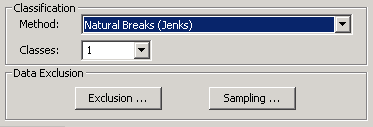 ). I then gave this one class the color white.
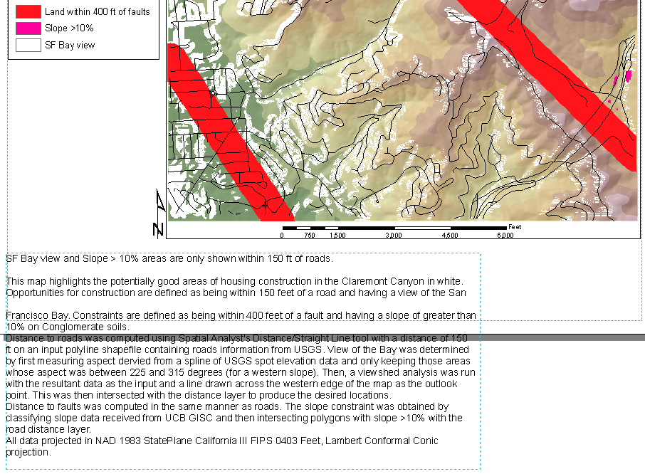
I then turned on the hillshade and splined spots layers, and gave the spline a transparency. I left the fault and high-slope colors as before, and moved these two layers on top of all others, most importantly the viewshed one. I also added roads for context. I added a legend, north arrow, and scale bar. Then, from the resultant map, we can say that areas in white are good to build on:
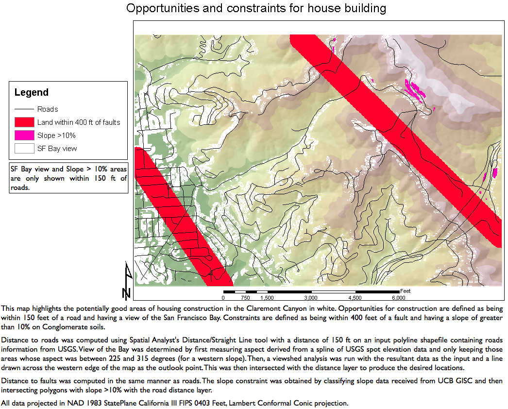
We can see already that the "Bay view" analysis wasn't fully correct, since there are a few white splotches on the far east side of the map and it should be obvious that no Bay can be seen from there since the locations are on the other side of a mountain peak. However, the analysis might still provide a decent approximation nonetheless.
To align my elements well on the page and center them, I used the Graphics toolbar to make sure everything was aligned properly: 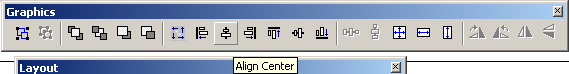
However, I did run into an issue with ArcMap where when you insert text, you cannot resize the text's container and have the text reflow. ArcMap seems to pick an arbitrary size for the container depending on the size of the font that you set (and, consequently, any changes to the size via the text box's properties dialog will simply increase the font size). Note from this screenshot how the text box does not have the resize handles that, say, the legend and map view do have.
As a result, to complete my map, I exported it to PNG without the text and then added the text in Photoshop.
back to Paul
Borokhov – Section
101 – 07
Students – C188 home