The DRG from Part I would not show the IKEA in Emeryville, because the data on the map is based from aerial photographs taken in 1958 and field survey checks performed in 1959. Since the IKEA was built in the late 1990s/early 2000s, there is no way for it to have possibly shown up in those data sources.
In Part II, the NWI Wetlands data was named "NWI Wetlands - 24K - E00 Format - NAD27" instead of "NWI Wetlands - 24k - ARC/INFO format". It was really nice how perfectly the East and West data lined up.
In Part III, we can figure out the projection of the West Oakland Hazardous Materials Facilities data by looking at the linked metadata on the website, which states that the file is in the California State Plane Coordinate System, Zone III, NAD 1983 (GRS 80).
Lastly, in Part IV, the Spatial Analyst extension wasn't turned on by default, so all the buttons on its toolbar were disabled. Turning on the extension fixed the problem.
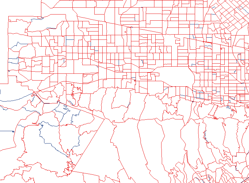
When comparing 1990 and 2000 Census blocks, we can see that some block lines have been slightly "re-alinged" (i.e. shifted north/east, etc.), while other blocks have been broken up into more than one block. This makes sense, because as the population in a region grows, a single, large block can no longer be used properly to characterize the people living in it. Here's an exmaple (red = 1990, blue, when different from red = 2000):
Initially, I was having trouble with the joins because I joined the data table to the attrbute table, instead of the other way around, and thus the mapped data set was not changed. Once that was out of the way, I produced a number of maps. For the backdrop, I used 30-meter NED hillshades in MrSID format and State Highways from the TIGER data set. The county I used for my maps was Los Angeles, which is where I live when I'm away from school (but not where I grew up). To make the data understandable, I used a grayscale color ramp and gave the Census data layer a 20% transparency. I also modified the hillshade layer to display "white" as blue to represent water. In addition, for all of the maps on the webpage, I zoomed to the mainland area of LA County, ignoring Catalina Island, for improved readability. I came up with 4 different maps.
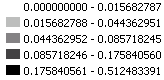
The first shows the proportion of whites to the rest of the population for any given Census block. I removed the block outlines for clarity and easier agglomeration of blocks with equivalent data.
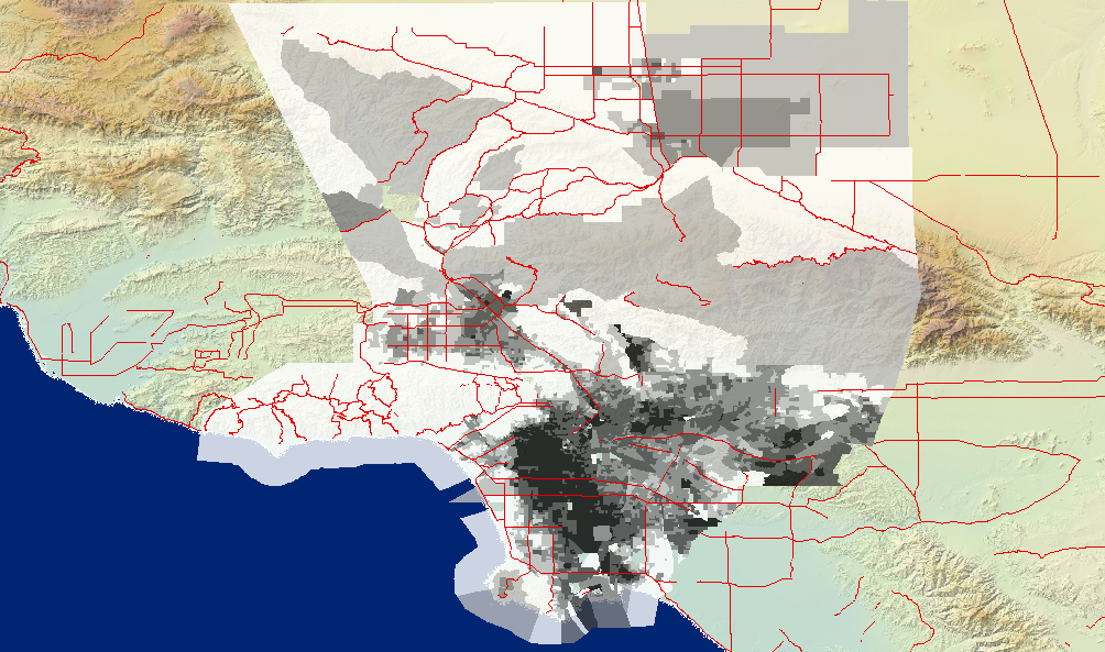
Higher proportions of whites are shown in white and lower proportions in black. While some white areas are actually low-population areas, we can still see from this map the extremely low concentrations of whites in the central Los Angeles (which is generally dominated by blacks), as well as relatively low concentrations of whites in East LA, which is genereally dominated by Latino and Asian populations. It is also worth noting that the regions in the far north of the county might appear to be more diverse than they really are due to the fact that they cover a large area.
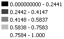
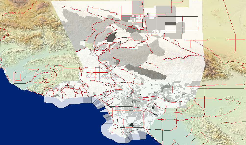
Then, I proceeded to map the population of blacks as a percentage of each block's population over the total population of blacks in the county. This allows us to see the distribution of the black population in LA county.
On the map, higher percentages are shown in a darker shade of black. This shows us that the vast majority of the black population of LA county resides in central Los Angeles, as mentioned in the previous map's discussion.
I then produced two different maps to analyze the population of minors (all persons under the age of 18) in the county. First, I created a new calculated field, whose value was AGE_UNDER5 + AGE_5_17. Then, I mapped the ratio of minors to the rest of the population in any given block, resulting in:
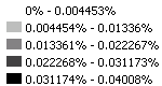
Here, higher ratios are shown in darker shades of black. I find it a bit challenging to interpret this data, since it doesn't seem to be related to anything in particular too well. There does seem to be a somewhat mild correlation between percentage of whites and percentage of minors, in that white regions tend to have lower percentages of minors. However, I would imagine that this factor tracks more with income than anything else, and the data sets didn't have any income data in them so I couldn't really verify this.
The second map I made shows the population of minors as a percentage of each block's population over the total population of minors in the county (again, higher percentages are represented with darker shades of black). This map is also a bit interesting, even if a bit jumbled:
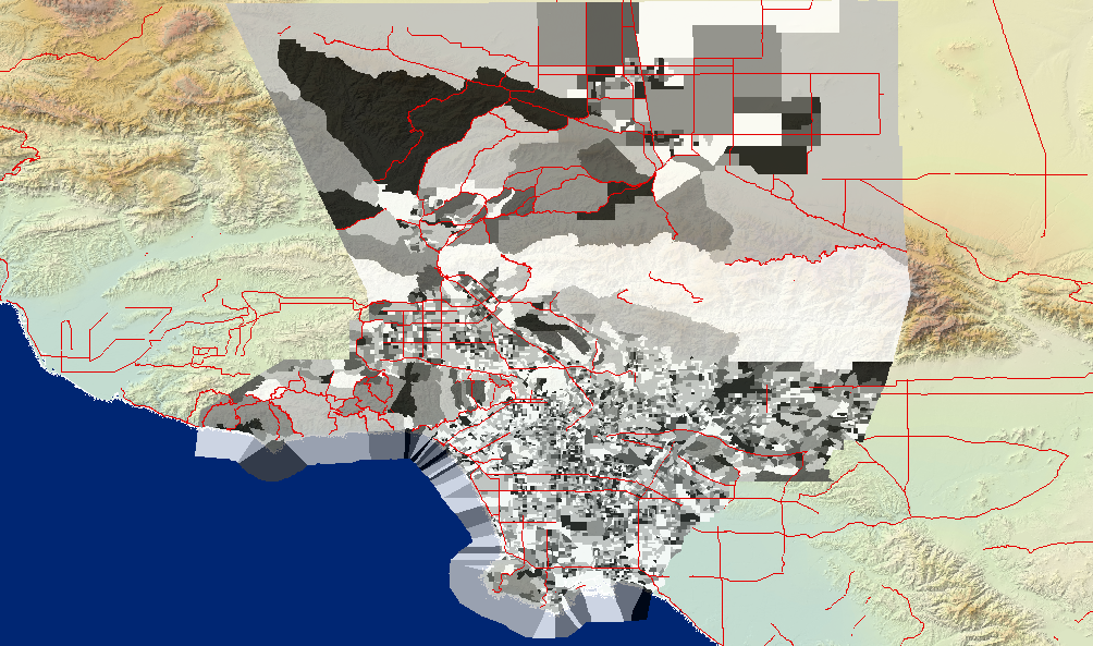
This map shows an interesting mosaic effect where certain blocks have higher percentages of minors, while those surrounding them tend to have progressively lower percentages as we move away from the center of the high-concetration area. One possible explanation of this is that the higher percetanges are concetrated around schools, with fewer minors living far away from schools. To verify this hypothesis, we would need to find some spatial data containing the locations of public schools in LA county (potentially from LAUSD) and see if it matches our prediction.