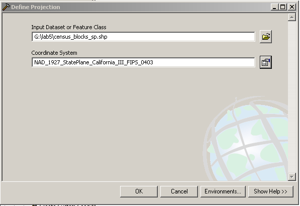
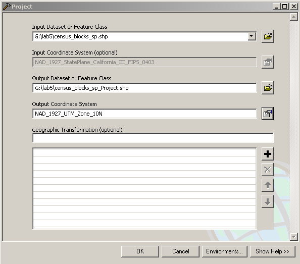
In this window I'm setting the projection for the census
blocks shapefile. After these changes, we can see the difference in
ArcCatalog:
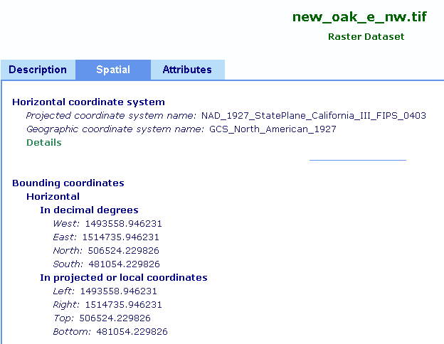
I added all of these to the map and also added the digital
ortho quad image to it, after specifying its projection.

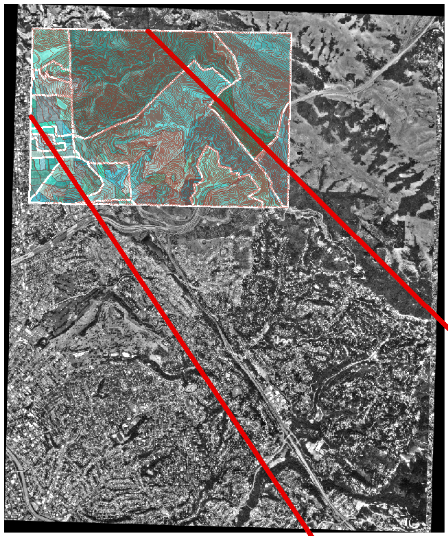
I exported the image with the projection info added to it and
added this exported image to the data frame. This was the map that was
produced as a result:
Then I created a new data frame to house my UTM-projected shapefiles and proceeded to project all of the CA State Plane shapefiles into UTM.
Here's a screenshot of one such projection:
I added all of the projected files into a separate data frame,
and then added the (previously exported) digital ortho quad image. This
was the result:
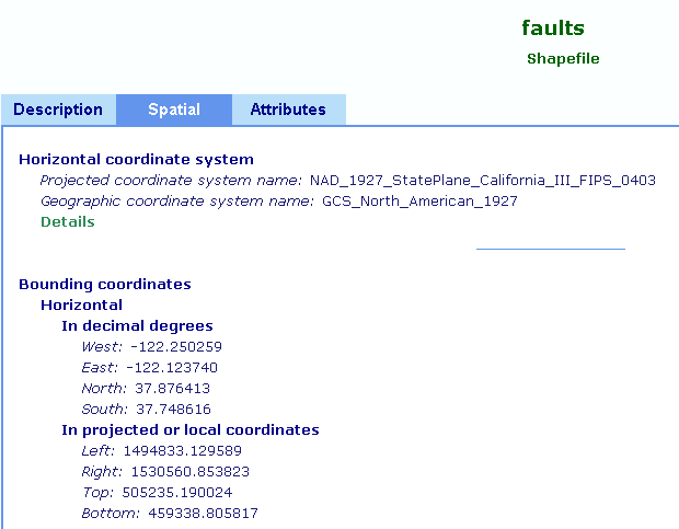
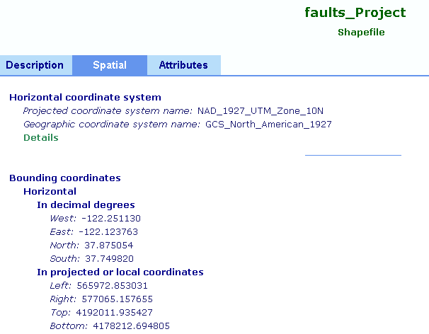
You can see the difference in projections by comparing the
earlier screenshot from ArcCatalog to this one:
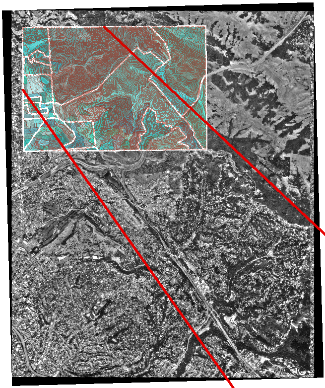
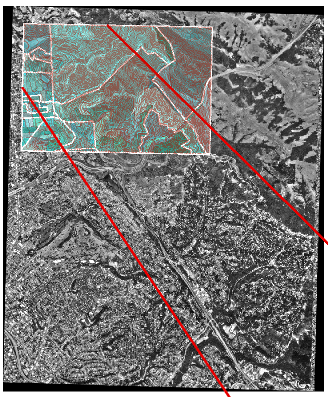
Just for fun, I added the unreferenced (original) digital ortho quad image to the data frame to see what would happen. From this screenshot, we can clearly see that the original image was not very usable without a proper projection assigned to it:

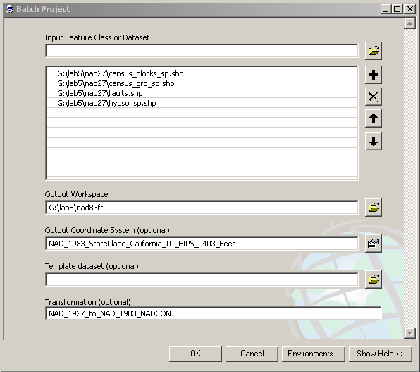
For the projection into NAD 83, I decided to use the batch
project tool to perform the projection at once for all of the files.
Here's a screenshot of the window:
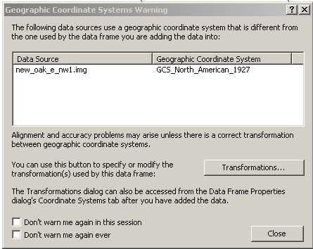
I verified that the correct transformation was selected and
then proceeded. Here is the resulting map:
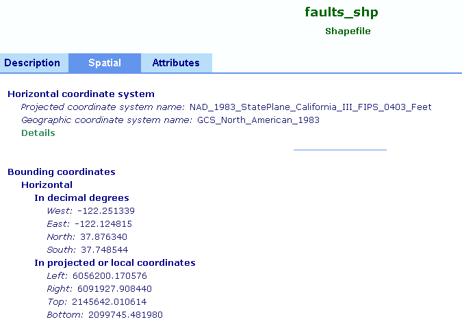
Taking a look at ArcCatalog again, we can see the current
projection:
When looking at the different maps produced by projecting the
same data onto CA State Plane III NAD 27, UTM zone 10, and CA State
Plane III NAD 83, we can see that the same data looks completely
different depending on the projection using which it is projected. This
makes sense, because a projection is a way of flattening the spherical
surface of the Earth and projecting it onto a 2-dimensional plane.
Different projections have different formulas for accomplishing this
effect, and thus the same geographic data will look different depending
on the projection used for rendering it on a flat surface.