In this lab more than others, I really spent a significant amount of time using ArcMap. In the process, I found the answers to some of my questions about how to do certain things, became really frustrated with the software in general, and learned that saving frequently is the way to go, since I have a tendency to make Arc crash.
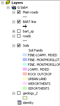
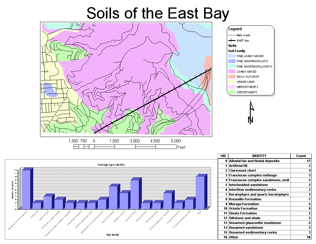
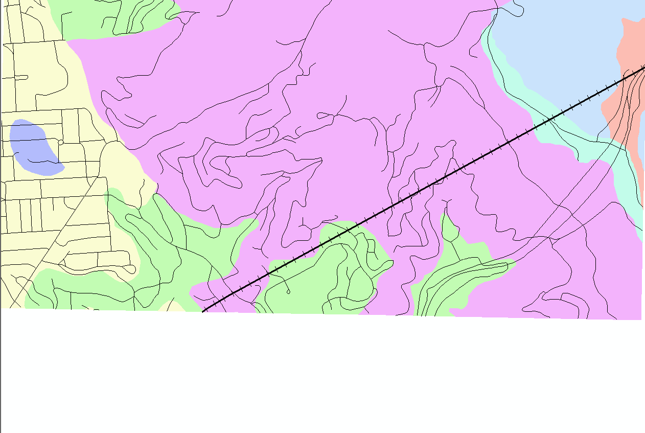
My map shows the different soil families in the East Bay. I decided to use this field instead of the more-traditional soil type because it is a bit less cryptic and also more general. In addition, I added roads and BART so that it is a bit easier to understand where the soils are exactly. For the chart and datable, I took data from the geology dataset and summarized it through a number of passes, both manual and automatic.
To begin, here's the table of contents of my final product:
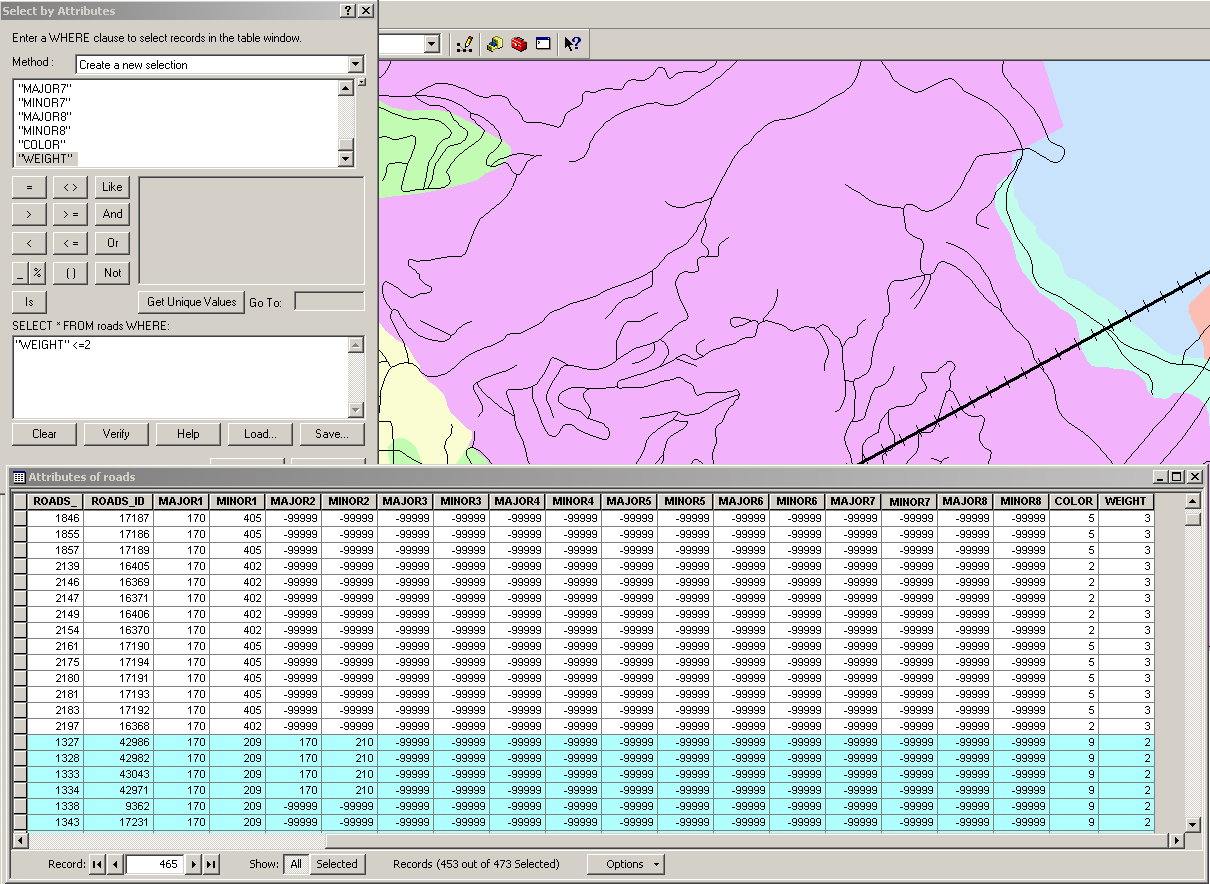
"Main roads" is the result of taking the roads data and filtering out
those that had a weight >2. The filtered-out roads are basically auxillary
ramps that don't really exist, and they made circles (such as the one on
Haste & Piedmont) overly complicated. Here's the SQL query I
made:
I then exported this data into a separate table and added it to the map.
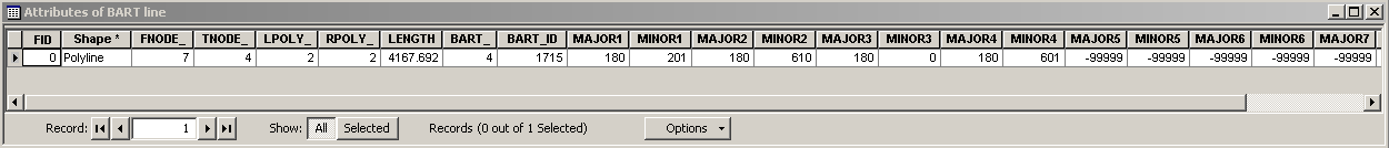
"BART line" is the result of the original BART attribute table with one of its rows removed
for clarity on the map, since the two lines were mostly
parallel. Here's the resultant data table that I exported and added to
the map:
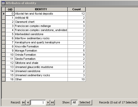
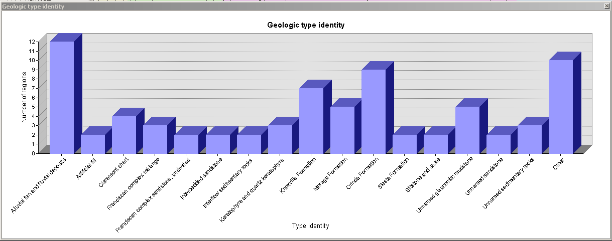
I then took the geology data to come up with a chart which summarized
the "Identity" field of the attribute table. First, I used Arc's
Summarize... feature to export a new table and add it to the project. I
then noticed that there were too many different values and creating a
chart would be problematic. As a result, I ran a SQL query to find out
the total number of rows that occurred only once in the data set, and
created a new row with the name "Other" whose value was that number of
rows.
After creating a chart from this table, I realized that the label names
were too long, and as a result, prevented the bottom axis from being usable.
Consequently, I removed the geologic periods that
were listed in parentheses. Here's the resultant data table:
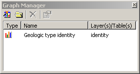
I then went ahead and made a final chart of the data, in 3D. I could
not figure out a way to change the ordering of the data on the axis,
however – it was alphabetical, and sorting the table after
creating the chart had no effect. Here's a view of the graph manager:
...and the actual graph:
I then went into layout view and put the pieces together. Arc crashed a
number of times during this step. Here's the final product:
While putting together the final map, I ran into a number of issues
with ArcMap. The most glaring one was its strange way of inserting the
graph into the layout. For some reason, when using the "Add graph to
layout" menu option, the inserted graph had very strange fonts with
letters that were squished together (as if in Arial Narrow) and had
strange extra spaces between them. However, if you copy the chart to
clipboard as an image and then simply "paste" it into the layout,
these problems go away. For comparison, I put
the two versions of the chart side-by-side, at the same size, and took
a screenshot:
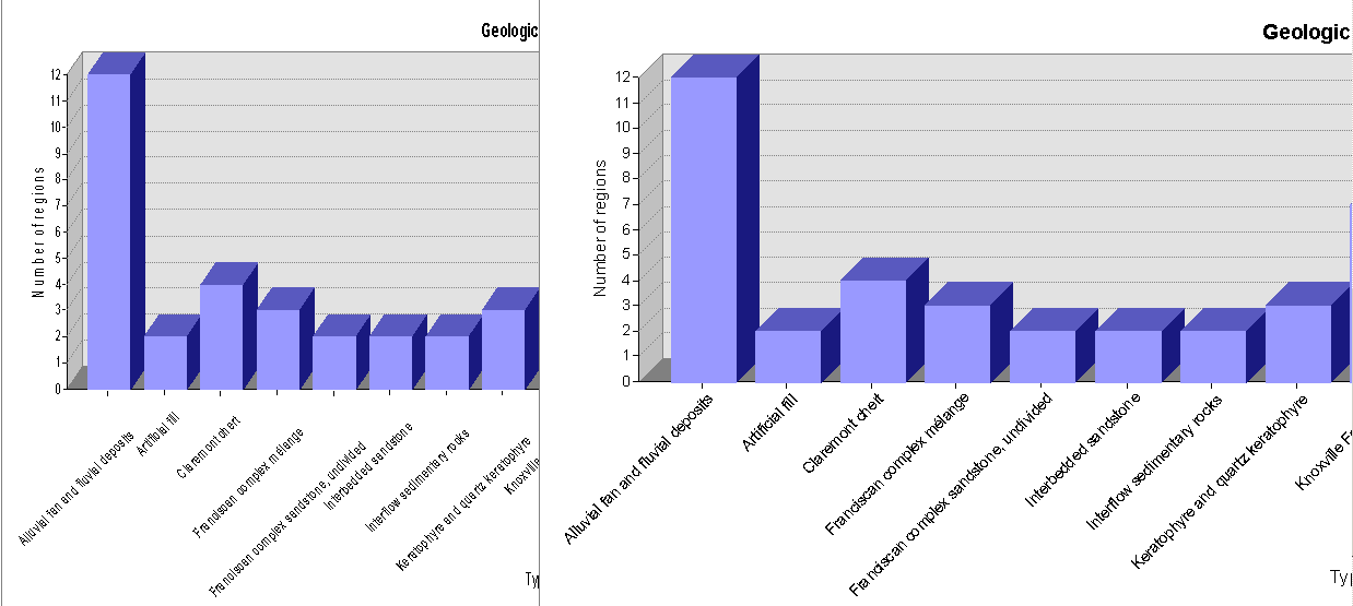
The one on the left resulted from "Add to layout"; the one on the
right, from copying to the clipboard. Note the odd proportions of the
first.
In addition, the bounding frame that contains the actual map is, in my
opinion, still much harder to work with than it needs to be. I don't
understand why there isn't a simple option to have the frame be only as
large as the data you have, without any strange additional margins or
padding. The lack of such a function makes it nearly impossible to
properly line up all the different elements on the page. There's also a
strange lack of consistency between what is shown in the Layout and
Geographic Data views. Compare the layout view above to what is shown
in the Geographic Data view at the same time:
This is, if nothing else, baffling and annoying.
As another point of irritation, after a data table is inserted into the layout, you have no way of adjusting it, and any adjustments you make to the data itself are not automatically reflected in the displayed data. What's worse is that the width of the columns is taken from the one used in the attribute table window, which makes very little, if any, sense. To me, looking at the attribute table is like looking at its "implementation." The way this data is displayed in the layout should have absolutely nothing to do with it. Since this is not the case, putting a good data table into the layout involves putting one in, seeing how well it's sized, opening the attribute table and resizing it accordingly, and then reinserting the table, potentially repeating the process a number of times before the desired table dimensions are achieved. This sort of thing might have been OK 15 years ago, but with the amount of human-computer interaction and user internface research that has happened in that time, it's simply unacceptable, especially for software that costs as much as Arc does. The bounding frame also had strange padding that had absolutely no reason to exist.
I also found out that once a data table from a "Summarize" action is exported, its name cannot be changed. I would love to find out why.
As a last and final nitpick, Arc's rasterizing engine seems to be very rough. While there are very good performance reasons for this, I feel that higher-quality rasterization should be possible without a significant performance hit. This is very easy to see on the North arrows, which look terrible on the screen but just fine on paper.