Lab3

I added a new field called "Heat spread" which is supposed to approximate the amount of heat spread per minute. I did this by adding a calculated field which multiplied the RATE_OF_SP column by the HSUBA column. Here is the number formatting window:
Number formatting window
and here is the data table after the field was inserted and formatted:
Data table with new field
Here it is with field sorted in descending order:
Data table, sorted in decreasing order on the HEAT_SPREA field

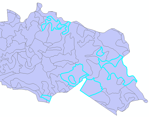
I then selected the records with a PERCENT_SL of >50% and a FLAME_LENG > 20. Here are the selected areas:
Selected rows of high slope and flame length

Here is my final map:
Final map
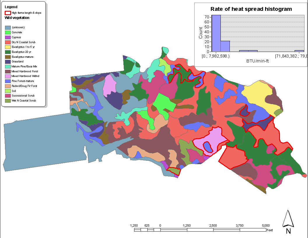
This map shows the different vegatation types, with areas of high slope and flame length outlined in red. There is also a histogram for the values of my newly-created calculated heat spread field. Unfortunately, I could not find a way to make the text inside the chart smaller so that the axis labels would fully fit within the chart.